[:en]
Localized Website Best Practices
Based on our comprehensive study of localized websites for the German market, we studied their navigation features to better understand how they were implemented.
The purpose of the study was to understand how critical factors were implemented in a company’s website localization efforts for the German market. This is the 2nd part of the comprehensive study. The first part titled Website Localization: Critical Factors for Success can be read by clicking on the link.
For the Localized website best practices of Navigation, we focused on the following 5 questions:
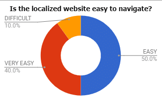
- Is the localized website easy to navigate?
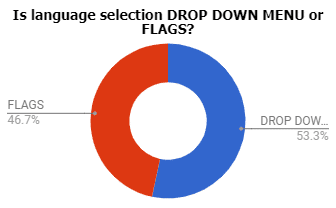
- Is language selection a drop-down menu or flags?
- Is the “Select a Language” drop-down at the top or bottom?
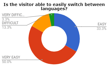
- Is the website visitor easily able to switch/change between different languages – no matter in which country he/she accesses the website?
- When switching between languages, does the currently displayed content remain in the same position or does the navigation jump to the start page of the language?
IS THE LOCALIZED WEBSITE EASY TO NAVIGATE?
The purpose of this question is quite straightforward and obvious. We wanted to know the level of difficulty when it comes to navigating the localized website. In this era where most of the websites are developed using templates, there’s no reason why any website should be difficult to navigate, regardless if it’s been localized or not. We measured this question using 4 choices:
- Easy
- Very Easy
- Difficult
- Very Difficult
Out of the 30 websites we analyzed, exactly half (15) were ranked to be “Easy”, 12 were ranked as “Very Easy”, and 3 were ranked as “Difficult”. None of the 30 websites had the ranking of “Very Difficult”. The chart below depicts this result:
IS THE LANGUAGE SELECTION A DROP-DOWN MENU OR FLAGS?
According to our analysis and review of localized websites for various markets; if a company’s website is localized for 1 or 2 languages then it might make sense to just display the flags of the country of the localized language. But when there are more than 2 languages to select, it is better to display a drop-down list. For this study, 16 websites chose to display drop down list and 14 chose to display flag(s). See the graph below:
IS THE “SELECT LANGUAGE” DROP-DOWN LIST AT THE TOP OR BOTTOM?
While this question might seem non-consequential, it is anything but! The placement of the “Select Language” feature falls within the overall scheme of site navigation plan, but this feature is very important. The question of how easy they can make this selection is of critical importance for a variety of reasons. One of the primary reasons is that if you’re selling products/services in that country, then there’s a 65% higher chance that you’ll make the sale if the visitors can view your website in their native language. For the purposes of this study, we found out that 24 out of 30 localized websites chose to display the “Select Language” option at the top, 4 chose to display it at the bottom, and 2 chose to display it in the middle. This result is depicted in the chart below.
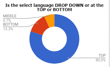
If we were to advise you on this question; it would be to place the “Select Language” option right at the top where it is easy to see and consume!
IS THE WEBSITE VISITOR EASILY ABLE TO SWITCH/CHANGE BETWEEN DIFFERENT LANGUAGES – NO MATTER IN WHICH COUNTRY HE/SHE ACCESSES THE WEBSITE?
This question is somewhat tied to the above question, but it is different in its purpose. Regardless of your visitor’s native language and your decision of where to place the “Select Language” option, it should be easy to switch between languages, if needed. For example, even if you place “Select Language” at the top, does the design make it easy to switch between languages? The level of difficulty of this feature is directly tied to how your visitors view your localized website. In our survey we found that 10 out of 30 websites were “Easy” to switch, 15 were “Very Easy” to switch, 4 were “Difficult”, and 1 was “Very Difficult”. See the chart below.
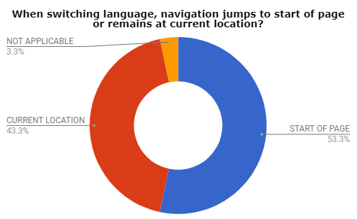
WHEN SWITCHING BETWEEN LANGUAGES, DOES THE CURRENTLY DISPLAYED CONTENT REMAIN IN THE SAME POSITION OR DOES THE NAVIGATION JUMP TO THE START PAGE OF THE LANGUAGE?
For our final question of this phase, we wanted to know how the website reacts when a different language selection is made. Does it remain in the same position or does the page jump to the top? In some cases, it makes good sense to keep it at the current location. And in other cases, it makes perfect sense to display top of the page. In our survey we found that 16 out of 30 localized websites decided to jump to “Start of Page”, 13 decided to keep it at the “Current Location”, and on 1 localized website we could not determine the result. We don’t believe this has a right or wrong answer. It just depends on the content use case.
All in all, these questions help us better understand how “Navigation” features are being implemented when companies localize their website. It is a best practice to implement the same methods as most localized websites have implemented, but there might be instances when you have to stray from the crowd based on your company’s specific audience and use cases.
We hope this helped in creating a better understanding of how to implement some of the “Navigation” features as you strive to localize your company’s website. We are happy to answer any questions you might have as you start your journey. Feel free to contact us with any questions you might have!
[:]

